ShopDreamUp AI ArtDreamUp
Deviation Actions

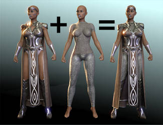
After DAZ declined a product if mine and Fuseling's, I went back to revisit its lighting and redo all the renders for it (and many of the skin settings; what I learned from that led to the Kasper tutorial).
In the process I discovered that I had been overcompensating with glossy settings that were too high, because most of my test characters were pale. There's a good reason why so many of the hyper-real renders you see have characters who look very tan and oily. It's the same reason why bodybuilders almost always use tanner and oils on their skin for competitions: visual detail on skin and muscle is easiest to see on shiny mid-toned surfaces.
Skin that is very pale tends to reflect so much light that it's whited out on the highlights, making the character's details harder to see. Skin that is very dark can actually absorb more light, so more light is needed to show off its highlights.
Now, I love extremes of color and tone on my rendered characters. So when working with very light or dark skins:
Very pale: Turn down the lights and use softer, more diffuse lighting (more, weaker lights).
Very dark: Turn up the lights and use harder, more direct lighting (fewer, brighter lights).
In neither case should you change the glossy settings. Human skin isn't actually shinier or oilier when it's dark (some dark-skinned people are more susceptible to dry skin than the very pale!). It's just that having a darker base color makes highlights more visible right up until you hit the "very dark" tipoff point where it becomes overly absorptive.
Because Iray is an unbiased engine, changing the gloss settings is no longer the best answer on adjusting for different skin tones as it was with DAZ Studio 3Delight. Adjusting the lighting is a much more successful method - you can light an albino or an aboriginal Australian with the same skin settings as long as the lights are set properly.
Now, there may be situations where you need the overall scene itself to have a certain type of light, and in that case, it may be best to darken your pale people and lighten your dark people a bit; it can be a decent "quick fix" if you've already created your detailed space scene and are tearing your hair out over trying to light everyone. So when in doubt, tan them. (Wink)")
In the process I discovered that I had been overcompensating with glossy settings that were too high, because most of my test characters were pale. There's a good reason why so many of the hyper-real renders you see have characters who look very tan and oily. It's the same reason why bodybuilders almost always use tanner and oils on their skin for competitions: visual detail on skin and muscle is easiest to see on shiny mid-toned surfaces.
Skin that is very pale tends to reflect so much light that it's whited out on the highlights, making the character's details harder to see. Skin that is very dark can actually absorb more light, so more light is needed to show off its highlights.
Now, I love extremes of color and tone on my rendered characters. So when working with very light or dark skins:
Very pale: Turn down the lights and use softer, more diffuse lighting (more, weaker lights).
Very dark: Turn up the lights and use harder, more direct lighting (fewer, brighter lights).
In neither case should you change the glossy settings. Human skin isn't actually shinier or oilier when it's dark (some dark-skinned people are more susceptible to dry skin than the very pale!). It's just that having a darker base color makes highlights more visible right up until you hit the "very dark" tipoff point where it becomes overly absorptive.
Because Iray is an unbiased engine, changing the gloss settings is no longer the best answer on adjusting for different skin tones as it was with DAZ Studio 3Delight. Adjusting the lighting is a much more successful method - you can light an albino or an aboriginal Australian with the same skin settings as long as the lights are set properly.
Now, there may be situations where you need the overall scene itself to have a certain type of light, and in that case, it may be best to darken your pale people and lighten your dark people a bit; it can be a decent "quick fix" if you've already created your detailed space scene and are tearing your hair out over trying to light everyone. So when in doubt, tan them.
Default VS. PBR Skin Shader: Alexandra 8 Tests
User @DigitalHallucination had some interesting comments and questions about shaders under the old Iray Surfaces tutorial from 2015. That led to some experimentation with shaders this morning, the results of which I will share now. Please, please feel free to comment and debate. I think this is an issue of interest to more or less all of us. I commented offhand that I didn't think the PBRSkin shader was an improvement, but that the maps in use were what made the difference, and DH disagreed with this and provided some comparison renders using Alexandra 8. They definitely looked definitive, so I decided to run my own tests. At first I tried it with base G8F, but that wasn't an apples to apples comparison because G8F originally uses the old glossiness method, so she's going to look worse compared to any shader that uses the new spec. So, like DH, I went to Alexandra. In this case I used the default lighting with the camera headlamp turned off, Subd1, Alexandra 8 at 100%, and the
Deviantart's Default AI Opt-In
EDIT: They put in a mass opt out! Thanks for letting me know when I missed the news, lovely watchers! I'm not thrilled about dA making AI opt-out and not opt-in, and putting it so you have to opt-out on each individual artwork. I have little to lose from this, because my product is 3D models and not the 2D promotional images, but it's especially predatory of people whose product and ouevre is 2D art. I don't know how many people are still here, but it's one more reason for people who draw and paint to delete their accounts.
Color Differences in DS 4.20.1.38
This was introduced by my notice by Snarl, and verified by my own render testing. I will show my results in the following discussion. There is a visible color difference in Iray render results in Daz Studio 4.20.1.38 vs. the pre-VDB, pre-ghost light fix 4.16.1.21 build I was able to test against. I rendered out to pngs and looked at both pngs on the same monitor to account for that type of differences. Here shown is G8F up close in default lighting on both builds. I checked all of the render settings to make sure they were the same, too, because if we could just change a render setting it would be an easy fix. This difference is relatively subtle. Let me show those separately so you can download them separately to compare. Here's 4.20: And here's 4.16: You might have to zoom in and set them overlapping so you see top part and top part or right and right, etc., but it's there. I don't know how or why this change has happened. Maybe it's because Daz decided the default was too
Babbling About Fluid Simulation
I have some feelings about sims right now. I have a lot of them, and I've just had caffeine. So I'm going to share them with you all. So, I recently submitted a water set for Daz Studio. Three times. You see, Daz3d didn't like either of my first two interpretations of the slosh pieces and pouring pieces that were simulated in Blender, so I ended up having to hand-sculpt parts of it and combine that with parts of the simmed pieces. The sloshes are entirely hand-sculpted from me staring at photo references, except for bits of the flying droplets I salvaged from the original simmed meshes. I wouldn't even have gotten that far if not for the very specific and detailed feedback they gave me, a privilege of working with the Review committee since 2011 and, I sincerely hope, demonstrating an eagerness to accept professional criticism when it gets me paid. I know for a fact that they have some artists where they just say an unvarnished yes or no because it's not worth getting yelled at
© 2015 - 2024 SickleYield
Comments34
Join the community to add your comment. Already a deviant? Log In
While your tips here are useful I run into problems when I have characters with different skin tones in the same render. In particular, if I put an African American in the same render with other races I have a lot of trouble balancing out the tones and have to decide whether the others look too bright or the African American looks way too dark and hard to see.